Presenting: More Splashes!
The college semester rages on, but I'm still not dead! (Actually, it's not going all too badly.) Anyway, I've been doing more PhotoShop work for TV-Nihon, the fansubbing group I mentioned earlier!
So a new Rider series is coming out, and even though I personally think the main character looks really considerably garish, I decided to see what I could do anyway!
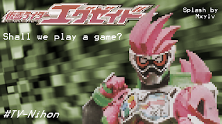 The first, pixelated one was based on the idea that (a) the series is partially based on video games (yes, I know) and (b) stylizing the image could distract the eye from the messiness of the suit in general. Unfortunately, the reviewer noted, the pixelation made it look a bit less pleasant than it could otherwise be, so I updated it with a less pixelated version! In case anyone's wondering how I pixelated the image, I just scaled the image to a really small size in PhotoShop, then scaled it back up with the upscale set to "Hard Edges."

The background itself is from a preset from After Effects (Animations > Backgrounds > Green Crystals) with the colors under "tritone" changed. Also notably, I gave the Rider an elbow (the image cut it off, as you can see more clearly in the pixelated version) by making a mask around his arm that was shaped like an elbow (two layers, actually--one was feathered and went over the arm to make it look like it was supposed to be there, and another that wasn't feathered and therefore could provide an actual edge for the elbow). Finally, I made the colors of the rider and logo less intense by putting a layer over it that made it look sepiatoned, then made the layer transparent, so the rider/logo were just a little bit sepiatoned.
Now to move on to a different splash page for Ghost (which has just wrapped up by this writing) in what may be my most beautiful splash yet:
 By "beautiful" I don't necessarily mean "well done," but what I mean is that my previous splashes (even ones for lighter series) had used a lot of darker colors (in fact, they rarely had a background beyond black), so I decided to change that around with this picture. I set up a transparent gradient in front of the background (the clouds + logo, which is the title screen for the show itself) for the effect, and I feel like a graphic design class helped with some of the other details (particularly the relationship between the color/placement of the text and the background gradient/other riders' colors). In case you couldn't tell, the transparent object in the center is the main rider's final form, in the middle of a now-iconic flying kick.
So a new Rider series is coming out, and even though I personally think the main character looks really considerably garish, I decided to see what I could do anyway!


The background itself is from a preset from After Effects (Animations > Backgrounds > Green Crystals) with the colors under "tritone" changed. Also notably, I gave the Rider an elbow (the image cut it off, as you can see more clearly in the pixelated version) by making a mask around his arm that was shaped like an elbow (two layers, actually--one was feathered and went over the arm to make it look like it was supposed to be there, and another that wasn't feathered and therefore could provide an actual edge for the elbow). Finally, I made the colors of the rider and logo less intense by putting a layer over it that made it look sepiatoned, then made the layer transparent, so the rider/logo were just a little bit sepiatoned.
Now to move on to a different splash page for Ghost (which has just wrapped up by this writing) in what may be my most beautiful splash yet:


Comments
Post a Comment