Posts

Showing posts with the label 大学 (College)

Kollege Ketchup: Photoshop! Part 2: Everything Else
Image
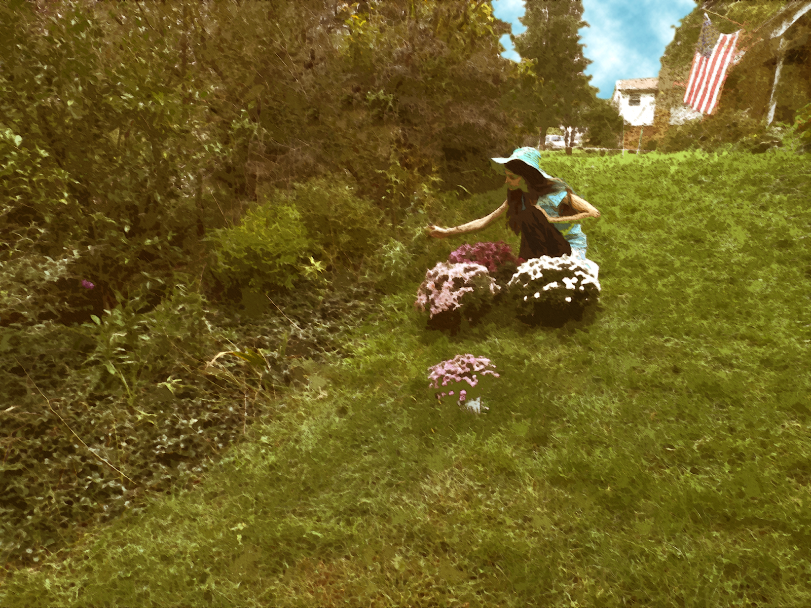
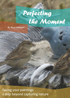
Let's jump right in! My second project was to create a "painted" book cover; interestingly, this took things beyond the simple filters I'd been anticipating, instead focusing on making little smudges on the image to get the individualized effect of actual brush strokes.       My next project required me to add myself in a historical photograph; while I'd usually go for something tongue-in-cheek, I ultimately went for the Vietnam War instead, requiring a more somber tone. I settled on the Layer Styles panel's Inner Glow option to help blend myself into the photo a little more, while using a Levels adjustment layer to get the lighting into place.  If memory serves, I believe I also went for a layer of noise over the entire image, and while a more prominent shadow would have been helpful here, I was able to get some of the grass in front of my feet, which also helped.         The class' final assignment concerned motion blur. Similar to the "painting...
Kollege Ketchup: Photoshop! Part 1: The Movie Poster

Image
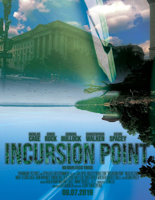
As part of my final college year, I took a course exclusively focused on the program that started it all, even before my Blender work: Photoshop!  My first assignment was to create a superhero or science fiction movie poster. I decided to go wild with this (in part because I was actually making a movie at the time), and the result is possibly the most references since a college self-portrait 6 years ago . Here we go:  The cast noted is based on the proposed cast of Superman Lives (I was originally going to make a fan poster for that, but my concept had to be original) The title, "Incursion Point," is a reference to ABYDOS: Incursion Not sure why I chose Paramount or Spyglass as the producers; maybe the latter was a nod to Sixth Sense , or maybe it wasn't "Valtapaz Videos" is Turbulence's "company" Kenji Kawai is a reference to the Ultraman works he fantastically scored, including Ultraman Nexus and Ultraman Zero: The Movie Nathan Furst is the com...

Kollege Katch-up: Illustrator!

Image
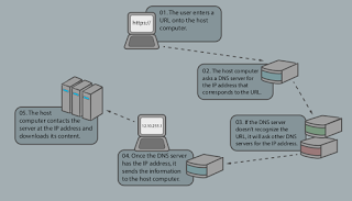
 Okay, let's hop right to it! I'll straight-up admit that I don't recall the details on this class as well as I do some others, so apologies in advance for a bit of vagueness ahead. My first assignment was to build a diagram; I decided to go with a more detailed version of the web server explanation I'd made earlier. There was quite a bit of copy-pasting here, but it does feel more straightforward than my previous attempt.       I developed this logo for Turbulence, the universe in which ABYDOS and its sequel take place. I decided to go for a reasonably straightforward approach--the letter T and (turbulent) wind. The drop shadow and other elements may be dated, but it's also designed to work in more minimalistic forms. My college project for this concerned sticking a logo on presets for business papers, calling cards, and so on.  Finally, my next assignment was perspective-based; I discovered quite a few interesting tools by this point, so I decided to take the ...

College Catch-up: InDesign and Digital Media Basics!

Image
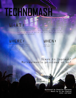
When we last checked up on my college work , I'd submitted my final project for a graphic design class, a poster on the only-more-relevant issue of police brutality. With that said, a lot of my later work hasn't really been discussed here, and while some of that's because my junior year focused more on fine art than digital art, I still have a number of digital-related classes I haven't gotten to, among them a program I've only touched on once before on the blog! I found myself going back to the layout-focused InDesign . One of the more fun tools here was the Feather Gradient, which enables one to seamlessly overlay two images (one can technically do the same thing with Photoshop by copy/pasting a black-and-white gradient as a mask for one layer, but the Feather Gradient was definitely a more convenient alternative).  For my first project, I was required to make a flier for a dance party of our choice; while my knowledge of InDesign was certainly put to the tes...

ABYDOS II VFX Work is Finished!

Image
I'm pleased to announce... well, the title gave it away, but I may as well note that I've finished effects work on ABYDOS II, also known as “ABYDOS: Incursion!” Barring finalized credit text, both the Blender and After Effects sides of the project are now done, so everything else that's left are a good chunk of the sound work (including a custom soundtrack!) and the final editing! It's been a little over half a year since my last Incursion (or anything else)-related post, so it feels fair to mention what's been happening during my personal life through that time. First of all, I've graduated college and have just held my commencement! That was an amazing ride and quite a helpful one, with a film appreciation class giving me a more solid understanding of editing in particular. Secondly, I've been taking on a couple of freelance jobs while looking into entrepreneuring and full-time employment options; while these haven't been directly applicable to AB...

My Final Graphic Design Project

Image
For my final project, I was supposed to choose an issue I felt strongly about, use a pantone color for the background, and make a text and image illustration to convey the message.  My choice was police brutality.  Interestingly enough, the challenge seemed not technical but intellectual; the class was teaching me to think differently as a designer, rather than just how to use Illustrator.  It was when my professor mentioned to me that a handcuff silhouette looked like eyes that I seemed to get it more. (Note: the website mentioned is completely fictitious; as of this writing it does not exist.) Apparently one point in this course is a bit of minimalism; there's just enough of the officer to see him, but there isn't any clutter or anything fancy.  I still think detail has its place (I very much prefer the Windows XP/7 visual style over 8 or 10, for instance), but I can certainly see the strength of minimalism here. 

Some of My Other Graphic Design Projects

Image
One was fun: I had to write words in a way that demonstrated the definitions of the words themselves. Another assignment was to take a bad poster and redesign it.  I mean really, really bad.  As in, one that lacks any sense of coherence whatsoever.  I decided this one would do nicely. The only trouble was, I had no idea what a Geo-Filter was.  After reading it through I had less of an idea what it was (as opposed to being confused, I'd gotten completely the wrong idea about it).  After a bit of research, a choice from a selection of templates and a few thumbnails on pencil-and-paper (as, in Graphic Design, that was apparently especially important as we think differently that way than how we would with Illustrator), I ended up creating this: Much better!  Apparently, less is more in terms of being eye-catching; my professor asked me to reduce the word count several times, and there's a lot less random junk (such as the emoji and tons of logos) t...

Done with Finals!

Image
So finals happened and things got delayed a bit but I'm back!  Hopefully filming for ABYDOS will return pretty soon (turns out there's a bit more than I'd originally thought we'd need, but it should work pretty well), and I've done a bit more work on some of the effects from what I already have.  But on to more Graphic Design! One fun thing I ended up making was a letterform portrait!  This was quite interesting, particularly because it was made entirely of text (from the Zapfino font), primarily using parentheses, slashes (quite useful, as they're basically just straight lines), and another thing that I have no idea what the name is.  In fact, the original picture I based this on was one of many attempts for a photo resembling a portrait by Picasso . All I ended up doing was taking the photo, making it black & white and increasing the contrast (to see the lines and shapes better), and taking different type/letters and placing them onto the portrait,...

Graphic Design Class!

Image
So I've been taking four college classes, and one of them is related to art: graphic design!  I feel like this could go really well if I try and apply this to cinematography, especially with special effects projects in mind.  The class seems to be based primarily around Illustrator, an Adobe program that I've posted a bit of stuff on previously.   In any case, I've learned quite a bit more since then, but the main focus was not on how to use the program, but what to use it on and how to use it well.  My previous course mostly covered the technical details of the program, while this one is teaching me how to use what I've learned to its fullest potential.  My first assignment involved filling in certain parts of scribbles on a piece of paper to show what I saw: My second project, a bit more ambitious, was to create a logo for a fictitious (as far as I can tell) company, Used Book Cafe.   After a bit of feedback about its being a bit creepy, I've made s...

More Abydos: Late Edition

Image
    You may have noticed that I've been gone even longer than usual.  I've been taking five concurrent college classes, causing continuing constraints concerning Creative Cloud crafts.  Hoping to get back to posting regularly (at least once a month), and I've been building up the universe of Abydos, which I hope to complete filming for within a week or so after the semester.     I've been doing quite a bit with 2D animation, especially regarding Adobe Flash's frame-by-frame animation--and, if you'll believe it, pinned character animation in After Effects.  I decided to incorporate Abydos into my two final projects: a rotoscoped project done in Flash and a rigged short done in After Effects (which also features the title sequence I mentioned last post).  Again, these ideas don't have much to do with the story (despite the design being based on Zorg's character, the character ended up being voiced by me for the project), but I decided t...

Catching Up (Finally)

Image
Wow.  Between summer camp, a beach house and a week-long drive, I really haven't been doing much.  But anyway, here's my final project from the college class that I finished over two months ago !  Again using Cycles render, I built the room based on pictures, measurements and a self-made floor map of my grandparent's kitchen!  While it's a bit grainy (due to the Cycles mode) and it isn't the most interesting thing to look at, the room itself is possibly the most realistic thing I've rendered, using different ways of modeling (e.g. a very extruded circle for the furnace) and image textures!  It was a fantastic class, and I've learned a lot from it! 

More Updates: Seven Quick Takes Edition

Image
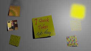
Decided to do another of these, since I'm behind on my posting.  Here we are: 1. I've gotten a request to do a tutorial on Jason the Jumper (if anyone remembers him)!  I won't get too technical, but here are some major points: a) Start out with some basic shapes. In this case, I started out with a subdivided cube.  b) Extruding is essential (using the E button in Blender).  I've heard from one of my books that the Extrude function is possibly the most useful tool in the whole of Blender. c) Make a rough version. The Subdivide Modifier is a great help with smoothing out a final version. For anyone interested, here's a more step-by-step version of how I made it (excluding the face).  It assumes you already know the basics of Blender; if this wasn't what you were looking for, there's a much more detailed walkthrough on a gingerbread man on Blender's wiki (the original page doesn't exist before, but it's on the Internet Archive). Here'...

College 2014: Final Assignment

Image
Finally! Now I have all my assignments on the blog before my next semester starts! My last assignment was an interesting one divided into five parts: Step 1: Make a Photoshop composition.  Here it is: Step 2: Take the previous project, take it a little bit further, and save it separately.  I decided to use the "painting" technique, only on different parts of different layers. Step 3:  Take product #2 and take it even further, saving it in a similar fashion.  Step 4: Go back to #1 and (how did you guess?) take it further, this time in a different direction.   Finally, step 5 (am I detecting a pattern here?): Take #4 and modify it somewhat, saving it as #5. I used masks and the clone tool + spot healing brush tool for most of the modification, although for #5 I used two tricks I learned from a seminar by Dr. Will Hammond (the Will Hammond who invented masking in Photoshop!): Copying parts of the background onto new layers and giving ...

College: Artistic Selfies Part II

Image
I now present... live action selfies!  All the monsters were done using Maya, which I don't know much about how to do, but some experimentation made the look work.  I did the energy beams in two layers: first, make a new layer, select a triangular shape (I did it using the polygonal lasso tool) and color it white with the brush tool, then make another layer (Shift+Ctrl+N) and place it under the first layer.  After that, go to the brush tool, set the hardness to zero and choose a color and paint on the white part!       These are the other two artistic selfies I did for my (now complete) college class, and the second, "Dimensional Shift," was accepted into and was shown in a student art convention my college held!  There's a lot I've been doing (mostly with Photoshop and After Effects), and I can't wait to get it all on the blog!  I'll try to post a bit more frequently until then.  Bye for now!

Fun with Filters (?)

Image
Okay, I admit, that is likely the worst title I've ever put on this blog.  Anyway, as the title suggests, I've been working on filters as part of my 2nd assignment for college: emulating other artists' artwork.  First, I tend to make what I'm working with a Smart Object (right click on the layer, then press "Convert to Smart Object") so I can modify the results later, but doing so isn't absolutely necessary. To make my stuff look like other artists' paintings, I was taught that (in Photoshop) pressing Filter -> Filter Gallery and selecting the "cutout" option, dropping the number on colors from a few million down to 8 or even 3, was a good start.  After that, selecting Filter->Oil Paint (which sadly isn't available on some older and newer versions of Photoshop, but it's on CS6) gives it a paint-like texture, and after that it's a good idea go to the Filter Gallery again and give it an "angled strokes" filter and ...