Posts

Showing posts with the label Photoshop

Kollege Ketchup: Photoshop! Part 2: Everything Else
Image
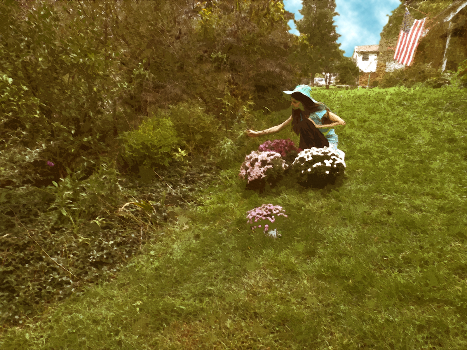
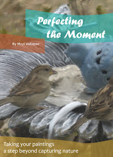
Let's jump right in! My second project was to create a "painted" book cover; interestingly, this took things beyond the simple filters I'd been anticipating, instead focusing on making little smudges on the image to get the individualized effect of actual brush strokes.       My next project required me to add myself in a historical photograph; while I'd usually go for something tongue-in-cheek, I ultimately went for the Vietnam War instead, requiring a more somber tone. I settled on the Layer Styles panel's Inner Glow option to help blend myself into the photo a little more, while using a Levels adjustment layer to get the lighting into place.  If memory serves, I believe I also went for a layer of noise over the entire image, and while a more prominent shadow would have been helpful here, I was able to get some of the grass in front of my feet, which also helped.         The class' final assignment concerned motion blur. Similar to the "painting...
Kollege Ketchup: Photoshop! Part 1: The Movie Poster

Image
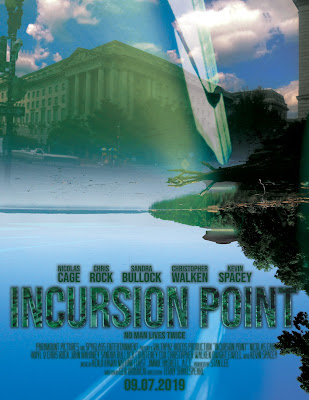
As part of my final college year, I took a course exclusively focused on the program that started it all, even before my Blender work: Photoshop!  My first assignment was to create a superhero or science fiction movie poster. I decided to go wild with this (in part because I was actually making a movie at the time), and the result is possibly the most references since a college self-portrait 6 years ago . Here we go:  The cast noted is based on the proposed cast of Superman Lives (I was originally going to make a fan poster for that, but my concept had to be original) The title, "Incursion Point," is a reference to ABYDOS: Incursion Not sure why I chose Paramount or Spyglass as the producers; maybe the latter was a nod to Sixth Sense , or maybe it wasn't "Valtapaz Videos" is Turbulence's "company" Kenji Kawai is a reference to the Ultraman works he fantastically scored, including Ultraman Nexus and Ultraman Zero: The Movie Nathan Furst is the com...

Oh, Yeah, I Haven't Posted This Yet

Image
Because, clearly, the BIONICLE content thus far was not enough. I actually published this around April, but felt I had to choose between this and the eye-tracking post and went with the latter.  Oddly enough, this video become easily my most watched video, having surpassed 1,000 views by this point (early four times as many views as my next most-watched video and over seven times ABYDOS' view count).  I think this is the first time I actually used Photoshop on a special effects project: unlike my live action work, where I have a physical camera and can record record the wall behind my actors and actresses (if someone jumps really high in a movie, for instance, I'd have to record the empty background to get the effect correctly), Tahu essentially stays in one place during the shot, meaning I had to remove him digitally.  After some initial masking work in After Effects, I ultimately took to Photoshop to manually remove him from the background; I'm feeling particula...

Presenting: More Splashes!

Image
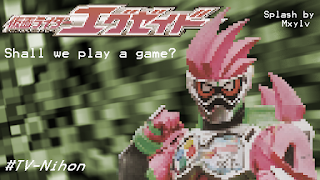
The college semester rages on, but I'm still not dead!  (Actually, it's not going all too badly.)  Anyway, I've been doing more PhotoShop work for TV-Nihon, the fansubbing group I mentioned earlier! So a new Rider series is coming out, and even though I personally think the main character looks really considerably garish, I decided to see what I could do anyway!   The first, pixelated one was based on the idea that (a) the series is partially based on video games (yes, I know) and (b) stylizing the image could distract the eye from the messiness of the suit in general.  Unfortunately, the reviewer noted, the pixelation made it look a bit less pleasant than it could otherwise be, so I updated it with a less pixelated version!  In case anyone's wondering how I pixelated the image, I just scaled the image to a really small size in PhotoShop, then scaled it back up with the upscale set to "Hard Edges." The background itself is from a preset from After Ef...

More Photoshop: Tokusatsu Edition!

Image
So, earlier I posted on doing some splash pictures (which help discourage piracy and retail via translation credits) for TV-Nihon , a major fansubbing group.  Since then, I've done two more, which I consider even better!  One of these was used for the 10th anniversary series of A Gold Wolf Knight Thing (disclaimer: neither is this the actual name, nor am I actually seeing the show this was used for). It isn't perfect (despite being the latest splash of the four I've done so far, as I was mostly on my laptop with this one I didn't have access to my full range of tools), but I think it still ended up pretty well.  As this was an anniversary series, I decided to use the main armor in its three different major forms throughout the different seasons. This second one was also used for Kamen Rider, although a much darker series (which, unfortunately for me, means several BoBs and GoGs*): Kamen Rider Amazons.  But hey, the main riders looked cool, and the subbers requ...

Done with Finals!

Image
So finals happened and things got delayed a bit but I'm back!  Hopefully filming for ABYDOS will return pretty soon (turns out there's a bit more than I'd originally thought we'd need, but it should work pretty well), and I've done a bit more work on some of the effects from what I already have.  But on to more Graphic Design! One fun thing I ended up making was a letterform portrait!  This was quite interesting, particularly because it was made entirely of text (from the Zapfino font), primarily using parentheses, slashes (quite useful, as they're basically just straight lines), and another thing that I have no idea what the name is.  In fact, the original picture I based this on was one of many attempts for a photo resembling a portrait by Picasso . All I ended up doing was taking the photo, making it black & white and increasing the contrast (to see the lines and shapes better), and taking different type/letters and placing them onto the portrait,...

February Update and More Photoshop

Image
   Nothing huge, but I made another splash page for Ghost (used in episode 14) featuring a key character's new movie form (on the bottom left):    In other news, the college semester has begun, so I've taken a break from filming (we still have another third or so to go, but it should go fairly well).    I'm currently enrolled in four classes, including a university-level biology class, so I might not do that much in the way of projects.  That said, hopefully I can keep some degree of concentration on (or rather, not lose sight of) the blog, Abydos and my other projects throughout the semester.

Photoshop Work: RPGs and Fansubbing

Image
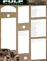
With all that's been going on, I forgot to mention that I've been doing a bit with Photoshop, some of which is now being used for professional and semi-professional purposes! A few months ago, I worked on a character sheet for Battlefield Press 's new role-playing game, Pulp Fantastic .  The game centers around the world of the superhero pulp novels of the early 1900s, and the character sheet (a completely free addition) is one of four existing variants made for different games in that style.  Another thing I've worked on is a splash image for Episode 5 of a fan-made English sub of the popular Japanese show, Kamen Rider Ghost (as the Kamen Rider series has no official release whatsoever in the US, fansubs are the closest we can come to professional releases).  The episode in question introduced a new rider, so I decided to work on one featuring both characters.  It was accepted surprisingly quickly (by TV-Nihon , one of the two major groups that currently wo...

I Was Bored in Photoshop Class One Day, Sooo...

Image
I decided to see what  Bionicle would look like in live-action!  Does anyone else want to not see a movie of this?  Because I'm not making a movie of this.

College 2014: Final Assignment

Image
Finally! Now I have all my assignments on the blog before my next semester starts! My last assignment was an interesting one divided into five parts: Step 1: Make a Photoshop composition.  Here it is: Step 2: Take the previous project, take it a little bit further, and save it separately.  I decided to use the "painting" technique, only on different parts of different layers. Step 3:  Take product #2 and take it even further, saving it in a similar fashion.  Step 4: Go back to #1 and (how did you guess?) take it further, this time in a different direction.   Finally, step 5 (am I detecting a pattern here?): Take #4 and modify it somewhat, saving it as #5. I used masks and the clone tool + spot healing brush tool for most of the modification, although for #5 I used two tricks I learned from a seminar by Dr. Will Hammond (the Will Hammond who invented masking in Photoshop!): Copying parts of the background onto new layers and giving ...

College: Artistic Selfies Part II

Image
I now present... live action selfies!  All the monsters were done using Maya, which I don't know much about how to do, but some experimentation made the look work.  I did the energy beams in two layers: first, make a new layer, select a triangular shape (I did it using the polygonal lasso tool) and color it white with the brush tool, then make another layer (Shift+Ctrl+N) and place it under the first layer.  After that, go to the brush tool, set the hardness to zero and choose a color and paint on the white part!       These are the other two artistic selfies I did for my (now complete) college class, and the second, "Dimensional Shift," was accepted into and was shown in a student art convention my college held!  There's a lot I've been doing (mostly with Photoshop and After Effects), and I can't wait to get it all on the blog!  I'll try to post a bit more frequently until then.  Bye for now!

Fun with Filters (?)

Image
Okay, I admit, that is likely the worst title I've ever put on this blog.  Anyway, as the title suggests, I've been working on filters as part of my 2nd assignment for college: emulating other artists' artwork.  First, I tend to make what I'm working with a Smart Object (right click on the layer, then press "Convert to Smart Object") so I can modify the results later, but doing so isn't absolutely necessary. To make my stuff look like other artists' paintings, I was taught that (in Photoshop) pressing Filter -> Filter Gallery and selecting the "cutout" option, dropping the number on colors from a few million down to 8 or even 3, was a good start.  After that, selecting Filter->Oil Paint (which sadly isn't available on some older and newer versions of Photoshop, but it's on CS6) gives it a paint-like texture, and after that it's a good idea go to the Filter Gallery again and give it an "angled strokes" filter and ...

College Assignments

Image
So as it turns out, my college class which I thought was on photography alone has a lot to do with Photoshop as well.  And my first assignment was to take five selfies and Photoshop them.  The only problem is that unlike most teenagers, I actually dislike selfies.  That said, the fact that my teacher phrased them as "self portraits" made it a bit better.  None of the pictures from this assignment were taken on a smartphone.  I'll only show three for now.  This first picture doesn't look like a selfie--in fact, I hadn't originally intended it as one--, but the teacher approved it.  I mostly took a picture of a swimming pool roof and altered the colors, then took a zoom-in picture on one of one of the lights and arranged those in a pattern, faking the"overlap" of the lights in the middle by putting a mask over (making invisible) a part of one light.  The second one is more of a noticeable self-portrait.   I added the shadow manua...

It's Been a While...

Image
So MERRY CHRISTMAS!!!!! (Yes.  I know. Don't. Please just don't.) Used: Clone Tool (restoration), Quick Masks & Hue/Sat layers (color).

My Photoshop Project

Image
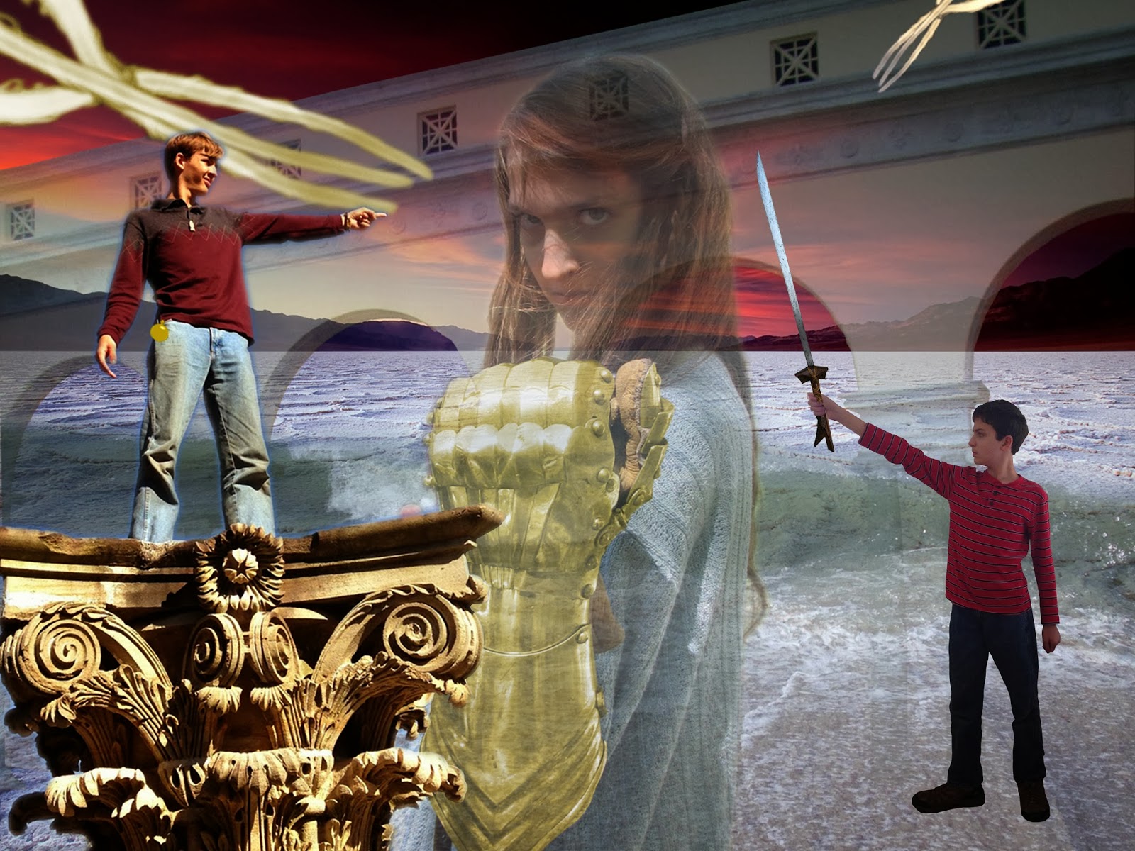
Finally!  After weeks of anticipation (from me, anyway) I've finally come to my last post on the college class!  Using quick masks (like erasing except it "hides" information instead of just erasing it), adjustment layers (see last post) and technically copyrighted material, I've produced my final project!  One of my favorite things about this is that a lot of it is actually real--I really was standing on that pillar, and my sister actually was wearing that glove, although it was originally silver (my brother's kampilan was photoshopped, unfortunately).  You can see where I got some photos right here .  The others I either took, got from Wikipedia (the sword), or Googled (Death Valley back there--under copyright, but apparently if you change the meaning of the picture--e.g. from nature to action--the copyright doesn't count).  If you have any questions, feel free to post some in the comments!

PS & Id

Image
My finals are DONE!  That said, I have quite a bit of catching up to do. First, I'll post about InDesign (even though I did PhotoShop first).  InDesign (Id) is for page layouts, pull quotes and that kind of thing.  Here was my project: I had to make the title and pull quote text fancy (via Paragraph Styles --assuming you've set the workspace to Essentials by going to Workspace-->Essentials, it should be on the right side of the screen), add images (File-->Place or Ctrl-D) and make the text wrap around it ( Text Wrap, next to Paragraph Styles ).  I also had to assign page numbers (from Pages , upward from Paragraph Styles , you can set them from the master pages). Next is the Table of Contents design. This used tabs to adjust to what degree which text is left-justified or right justified. On to PhotoShop! First, I had to clean up this: Before  This was done mostly by copying & pasting different parts of the screen (the H i...