Fun with Filters (?)
Okay, I admit, that is likely the worst title I've ever put on this blog. Anyway, as the title suggests, I've been working on filters as part of my 2nd assignment for college: emulating other artists' artwork. First, I tend to make what I'm working with a Smart Object (right click on the layer, then press "Convert to Smart Object") so I can modify the results later, but doing so isn't absolutely necessary.
To make my stuff look like other artists' paintings, I was taught that (in Photoshop) pressing Filter -> Filter Gallery and selecting the "cutout" option, dropping the number on colors from a few million down to 8 or even 3, was a good start. After that, selecting Filter->Oil Paint (which sadly isn't available on some older and newer versions of Photoshop, but it's on CS6) gives it a paint-like texture, and after that it's a good idea go to the Filter Gallery again and give it an "angled strokes" filter and a "texturizer" filter for a more genuine feel.
Sometimes the picture will look unrealistic, and that's probably because of the lack of variety in colors or detail. However, that's easily fixed: make a copy of the original picture, then blend them together however it pleases you (Lighten, Screen or just Overlay often work for me). Anyway, here are my pictures:
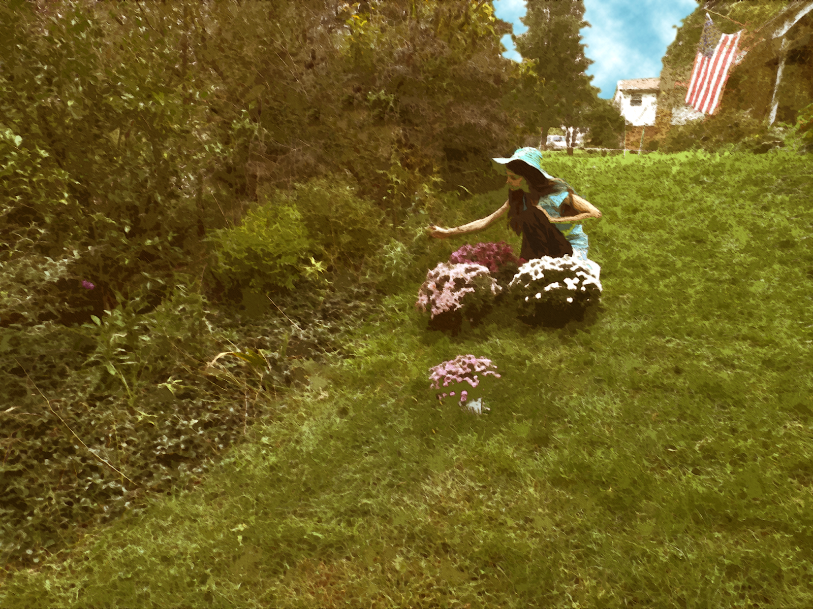
Matilda Browne, In Vorhee's Garden:
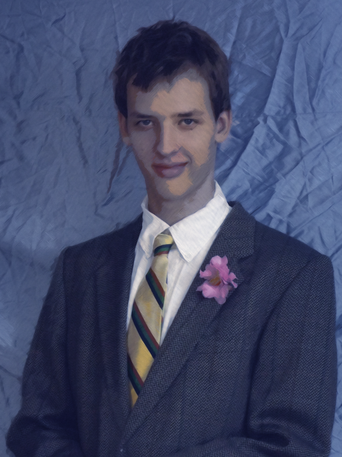
Picasso? (Blue Period), Portrait:
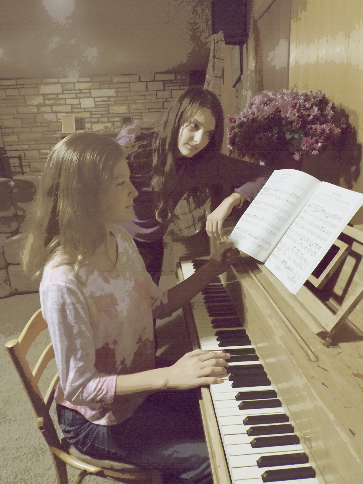
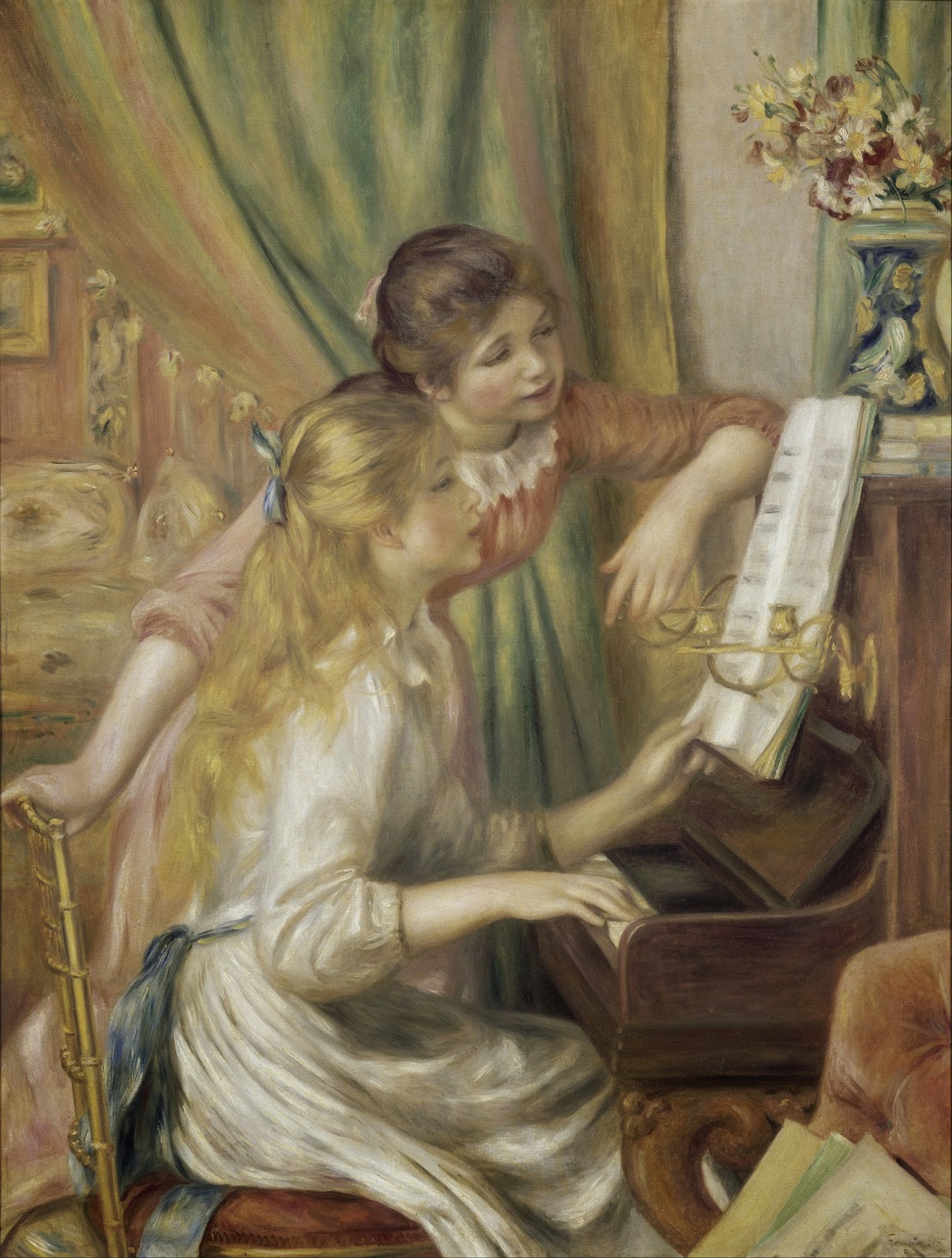
Renoir, Girls at the Piano:
Whistler, Whistler's Mother:
Claude Monet, The Water Lily Pond:
To make my stuff look like other artists' paintings, I was taught that (in Photoshop) pressing Filter -> Filter Gallery and selecting the "cutout" option, dropping the number on colors from a few million down to 8 or even 3, was a good start. After that, selecting Filter->Oil Paint (which sadly isn't available on some older and newer versions of Photoshop, but it's on CS6) gives it a paint-like texture, and after that it's a good idea go to the Filter Gallery again and give it an "angled strokes" filter and a "texturizer" filter for a more genuine feel.
Sometimes the picture will look unrealistic, and that's probably because of the lack of variety in colors or detail. However, that's easily fixed: make a copy of the original picture, then blend them together however it pleases you (Lighten, Screen or just Overlay often work for me). Anyway, here are my pictures:
Matilda Browne, In Vorhee's Garden:

Renoir, Girls at the Piano:


Whistler, Whistler's Mother:
Claude Monet, The Water Lily Pond:


Comments
Post a Comment