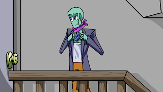
Robotrio Behind the Scenes: Ace McNacho in 3D, Part 2

When I last left off, Ace didn't look bad, but there were a couple of issues. First off, at this point the color scheme felt extremely desaturated (see left), despite my choosing the exact colors--to the pixel--of the non-shadowed areas in Ace's character reference sheet. I consulted Leena about it, and it turned out that 2D Ace's darker colors were more saturated than his lighter colors, which helped the 2D image "pop" more. Sure enough, once I darkened and saturated Ace's coat to something of a mix between the two values, it looked much closer to Ace. Another issue was the lighting; the "window" was set up to emit light, but it was emitting a remarkably small amount of it--enough so that the fake lighting of the bottom-right corner was brighter than its "source." With that said, this was a pretty easy fix, and scaling the scene down to be closer to Ace's canon height forced me to redo the lighting anyway. The biggest change was ...
