The Rest of Illustrator
Finals are fast approaching for me and I notice that I've only posted one post on my college experience. So, here's the rest of the stuff I've been doing in Adobe Illustrator:
1. Varga.
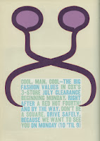 You'll have to trust me that the symbol didn't start out purple. The goal here was that I'd use the Pen Tool to "trace" the odd now-purple symbol by a man named Arnold Varga, the trick being that it had to be achieved with 25 anchors (clicks) or less.
The pen tool uses Bezier Curves, a kind of curve that makes curves that are always in a 180 degree relationship. In other words, if I click and drag and draw 3 vertical lines identical in height exactly .3 inches away from each other, they look like this:
Actually, I don't know quite how else to describe Bezier Curves mostly because I don't know how they work myself. Either way, though, you get better at it when you practice.
2. The Crash Course.
 This experiments with just about everything else in Illustrator--typing text, linking it to a path and fitting it into a shape, giving text fill (color) and stroke (outline) color, breaking up the text into individual objects to make them look generally weird, making a picture out of basic shapes (the duck) and then making it into a randomizable symbol, applying gradients (rainbow) to two squares as both linear (lines) and radial (circle) and to the brush tool [stops for breath], turning a scanned image into a brush and changing its color (purple and blue), and for those of you who are still awake and conscious, taking three shapes and merging, separating and dividing them.
3. Design.
 This project had two parts: I had to, using four squares of potentially different locations, sizes and rotations, think up 10 combinations of squares representing the words bold, increase, tension, and playful. Then I had to choose what I thought to be my best 3 pictures for each word and redraw it in Illustrator (some modification of the squares was allowed). I had a hard time with "tension" until my teacher said I should try to "make Alfred Hitchcock nervous"--and walked up to about two feet away from me and asked if it made me feel uncomfortable, and then told me to put that feeling into the picture. Unsurprisingly, I had vast improvements a few minutes after.
4. Patterns.
 For this assignment, I was supposed to make a pattern--preferably one inspired by Celtic, Japanese or a few other country's designs--out of basic shapes and apply it to a few other shapes. Mine was Celtic-inspired. However, having the Bill Nye "patterns" song running through my head whenever I was working on it--at all--did NOT help.
5. The Assessment.
No need for complicated explanation here; the assessment just takes everything I learned and puts it to the test.
I'll post my PhotoShop and InDesign assignments in future posts!
1. Varga.

The pen tool uses Bezier Curves, a kind of curve that makes curves that are always in a 180 degree relationship. In other words, if I click and drag and draw 3 vertical lines identical in height exactly .3 inches away from each other, they look like this:
Actually, I don't know quite how else to describe Bezier Curves mostly because I don't know how they work myself. Either way, though, you get better at it when you practice.
2. The Crash Course.

3. Design.

4. Patterns.

5. The Assessment.
No need for complicated explanation here; the assessment just takes everything I learned and puts it to the test.


I'll post my PhotoShop and InDesign assignments in future posts!


That is really cool, you are so brilliant!
ReplyDeleteKeep up your fantastic work!!!
Mumpy