College Catch-up: InDesign and Digital Media Basics!
When we last checked up on my college work, I'd submitted my final project for a graphic design class, a poster on the only-more-relevant issue of police brutality. With that said, a lot of my later work hasn't really been discussed here, and while some of that's because my junior year focused more on fine art than digital art, I still have a number of digital-related classes I haven't gotten to, among them a program I've only touched on once before on the blog!
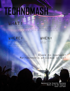
I found myself going back to the layout-focused InDesign. One of the more fun tools here was the Feather Gradient, which enables one to seamlessly overlay two images (one can technically do the same thing with Photoshop by copy/pasting a black-and-white gradient as a mask for one layer, but the Feather Gradient was definitely a more convenient alternative). For my first project, I was required to make a flier for a dance party of our choice; while my knowledge of InDesign was certainly put to the test, a major element here (as with my earlier Illustrator-based class) was graphic design.
…I think I like gradients.
…I think I like gradients.
Interestingly enough, for a second class the same semester, I ended up going back to Illustrator for a couple of projects: a storyboard for a website and an explanation of some uncommon knowledge I had---in this case, an HTTP request.
These were pretty mild in the grand scheme of things (I don't think I'd make a solo post about them), but Illustrator proved a pretty handy program for fast but reasonably professional-looking graphics; it's a pretty good balance between pulling up Photoshop for naturalistic art and, well, Microsoft Paint.


Comments
Post a Comment