Kollege Ketchup: Photoshop! Part 1: The Movie Poster
As part of my final college year, I took a course exclusively focused on the program that started it all, even before my Blender work: Photoshop!
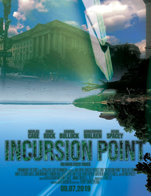
My first assignment was to create a superhero or science fiction movie poster. I decided to go wild with this (in part because I was actually making a movie at the time), and the result is possibly the most references since a college self-portrait 6 years ago. Here we go:
- The cast noted is based on the proposed cast of Superman Lives (I was originally going to make a fan poster for that, but my concept had to be original)
- The title, "Incursion Point," is a reference to ABYDOS: Incursion
- Not sure why I chose Paramount or Spyglass as the producers; maybe the latter was a nod to Sixth Sense, or maybe it wasn't
- "Valtapaz Videos" is Turbulence's "company"
- Kenji Kawai is a reference to the Ultraman works he fantastically scored, including Ultraman Nexus and Ultraman Zero: The Movie
- Nathan Furst is the composer of the original BIONICLE movie trilogy
- Jimmie Haskell scored the original Land of the Lost
- Stan Lee ('nuff said!)
- Gen Urobuchi was the screenwriter for Kamen Rider Gaim, one of the long-running series' more well-received entries (even if I haven't finished it...)
- Terry Shakespeare directed the BIONICLE movie trilogy.
For some reason I thought it had more references than that... Oh yeah, 09/07 was another Land of the Lost reference: the first episode aired on September 7, 1974. Anyway, there are a couple of other Incursion influences (including green lights and a ghostly figure of myself taken straight from the footage), but I admit I was mostly after making a cool poster. (In case anyone's wondering, the custom machine was Blender, made to distinguish the poster from a horror or fantasy genre).
Making this was interesting; I could make a fairly creative-looking background with some blended lights and a ghostlike being, but it ended up looking far too simple, so I (over?) compensated with the machine and stylized title. Awkwardly, I ran into an issue where saving as a layer-enabled PDF and back as a PSD flattened the image, giving me a hard lesson to make backups, which I follow to this day with my Blender projects (thankfully, I was able to resume from a very early draft).
This was a very fun project, and while it took a few drafts I quite like the end result! I'll follow up with a post on my other three projects; hope to post back soon!

Comments
Post a Comment