Posts

Showing posts from 2016

We've Started Planning!

The entire ABYDOS crew (all four) have begun to collaborate and talk about work on ABYDOS II!  The project's planned to be a lot more collaborative than the first one, and it's also planned to not only explain the numerous questions in the original (some planned, some plotholes), but also to have a lot more in the way of character-driven moments and a stronger story itself.  As well, I've figured out several ways to up the ante on the effects, including a primitive alternative to motion tracking.  I'm definitely looking forward to making it, as well as getting some making-of videos up!
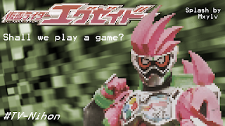
Presenting: More Splashes!

Image
The college semester rages on, but I'm still not dead!  (Actually, it's not going all too badly.)  Anyway, I've been doing more PhotoShop work for TV-Nihon, the fansubbing group I mentioned earlier! So a new Rider series is coming out, and even though I personally think the main character looks really considerably garish, I decided to see what I could do anyway!   The first, pixelated one was based on the idea that (a) the series is partially based on video games (yes, I know) and (b) stylizing the image could distract the eye from the messiness of the suit in general.  Unfortunately, the reviewer noted, the pixelation made it look a bit less pleasant than it could otherwise be, so I updated it with a less pixelated version!  In case anyone's wondering how I pixelated the image, I just scaled the image to a really small size in PhotoShop, then scaled it back up with the upscale set to "Hard Edges." The background itself is from a preset from After Ef

Abydos is Completed!

Image
After over a year of work, I'm finally done--and just in time, too, as my new college semester starts soon! This is by far my most ambitious video project to date, with both my After Effects and my Blender skills used to a much farther extent than anything I'd done before.  Aside from its technical aspects, there was a lot of acting, scripting, and even voiceover dialogue to an extent that my family's never tried before.  This took quite a bit of doing, and I can't wait to post about how it was made!  For now, let it be said that there was a lot of masking.  That said, there will be making of videos, and I'm hoping for a sequel!  I already have several ideas for new technical improvements... Ignore the Lights.  

Effects Work on ABYDOS is Complete!

Image
As of now, all the special effects and video editing is finished on ABYDOS!  All that's left are some voiceovers, which are more than halfway done, but after that the project is essentially finished!  I should be able to have a trailer out by the end of the month.  In the meantime, here's an official poster! 

July Update: ABYDOS Work Continues!

I've been mostly doing the editing and general After Effects work, hoping to add CGI elements later on.  The main challenge with the CGI seems to be lining it up with the footage (as, rather than using a not-so-free plugin or something else to put actual 3D into After Effects, I'm rendering the footage in Blender and then compositing it on top of the AE work).  One neat trick around this is that Blender does allow background images (including videos), so that'll be an excellent tool for matching up the camera and the video.  Hoping to get a lot of work done on it soon! 

ABYDOS Filming is Finished!

Image
I'm proud to announce that principal filming for ABYDOS has finished!  After the college semester, we'd officially resumed filming on May 14th and have finished on June 8th!  No idea when all the post-processing will be done, but I've done some of the effects work and it's shaping up pretty well so far!  Here are some behind the scenes photos with some filming locations and the ABYDOS crew: Ignore the Lights. 

More Photoshop: Tokusatsu Edition!

Image
So, earlier I posted on doing some splash pictures (which help discourage piracy and retail via translation credits) for TV-Nihon , a major fansubbing group.  Since then, I've done two more, which I consider even better!  One of these was used for the 10th anniversary series of A Gold Wolf Knight Thing (disclaimer: neither is this the actual name, nor am I actually seeing the show this was used for). It isn't perfect (despite being the latest splash of the four I've done so far, as I was mostly on my laptop with this one I didn't have access to my full range of tools), but I think it still ended up pretty well.  As this was an anniversary series, I decided to use the main armor in its three different major forms throughout the different seasons. This second one was also used for Kamen Rider, although a much darker series (which, unfortunately for me, means several BoBs and GoGs*): Kamen Rider Amazons.  But hey, the main riders looked cool, and the subbers request

My Final Graphic Design Project

Image
For my final project, I was supposed to choose an issue I felt strongly about, use a pantone color for the background, and make a text and image illustration to convey the message.  My choice was police brutality.  Interestingly enough, the challenge seemed not technical but intellectual; the class was teaching me to think differently as a designer, rather than just how to use Illustrator.  It was when my professor mentioned to me that a handcuff silhouette looked like eyes that I seemed to get it more. (Note: the website mentioned is completely fictitious; as of this writing it does not exist.) Apparently one point in this course is a bit of minimalism; there's just enough of the officer to see him, but there isn't any clutter or anything fancy.  I still think detail has its place (I very much prefer the Windows XP/7 visual style over 8 or 10, for instance), but I can certainly see the strength of minimalism here. 

Some of My Other Graphic Design Projects

Image
One was fun: I had to write words in a way that demonstrated the definitions of the words themselves. Another assignment was to take a bad poster and redesign it.  I mean really, really bad.  As in, one that lacks any sense of coherence whatsoever.  I decided this one would do nicely. The only trouble was, I had no idea what a Geo-Filter was.  After reading it through I had less of an idea what it was (as opposed to being confused, I'd gotten completely the wrong idea about it).  After a bit of research, a choice from a selection of templates and a few thumbnails on pencil-and-paper (as, in Graphic Design, that was apparently especially important as we think differently that way than how we would with Illustrator), I ended up creating this: Much better!  Apparently, less is more in terms of being eye-catching; my professor asked me to reduce the word count several times, and there's a lot less random junk (such as the emoji and tons of logos) that feel as out-of-pl

Done with Finals!

Image
So finals happened and things got delayed a bit but I'm back!  Hopefully filming for ABYDOS will return pretty soon (turns out there's a bit more than I'd originally thought we'd need, but it should work pretty well), and I've done a bit more work on some of the effects from what I already have.  But on to more Graphic Design! One fun thing I ended up making was a letterform portrait!  This was quite interesting, particularly because it was made entirely of text (from the Zapfino font), primarily using parentheses, slashes (quite useful, as they're basically just straight lines), and another thing that I have no idea what the name is.  In fact, the original picture I based this on was one of many attempts for a photo resembling a portrait by Picasso . All I ended up doing was taking the photo, making it black & white and increasing the contrast (to see the lines and shapes better), and taking different type/letters and placing them onto the portrait,

Graphic Design Class!

Image
So I've been taking four college classes, and one of them is related to art: graphic design!  I feel like this could go really well if I try and apply this to cinematography, especially with special effects projects in mind.  The class seems to be based primarily around Illustrator, an Adobe program that I've posted a bit of stuff on previously.   In any case, I've learned quite a bit more since then, but the main focus was not on how to use the program, but what to use it on and how to use it well.  My previous course mostly covered the technical details of the program, while this one is teaching me how to use what I've learned to its fullest potential.  My first assignment involved filling in certain parts of scribbles on a piece of paper to show what I saw: My second project, a bit more ambitious, was to create a logo for a fictitious (as far as I can tell) company, Used Book Cafe.   After a bit of feedback about its being a bit creepy, I've made some chang

February Update and More Photoshop

Image
   Nothing huge, but I made another splash page for Ghost (used in episode 14) featuring a key character's new movie form (on the bottom left):    In other news, the college semester has begun, so I've taken a break from filming (we still have another third or so to go, but it should go fairly well).    I'm currently enrolled in four classes, including a university-level biology class, so I might not do that much in the way of projects.  That said, hopefully I can keep some degree of concentration on (or rather, not lose sight of) the blog, Abydos and my other projects throughout the semester.

On a different note...

    It's been over a year since I've updated the blog's design, so I've decided to overhaul the blog just in time for the new year!  Other than the more evident changes, I've updated links under both My Software and under the list of related blogs/sites.  In terms of design, I've decided to balance out the emphasis on 3D with my more recent concentration on visual effects and story-based projects (particularly Abydos; the splash at the top of the page teases a CGI villain in the video).  I have a bit more to do for the blog (at the time of this writing, I haven't changed the background yet), but I'll certainly get around to it.  Ignore the Lights.