Posts

Showing posts from 2014

Fun with Filters (?)
Image
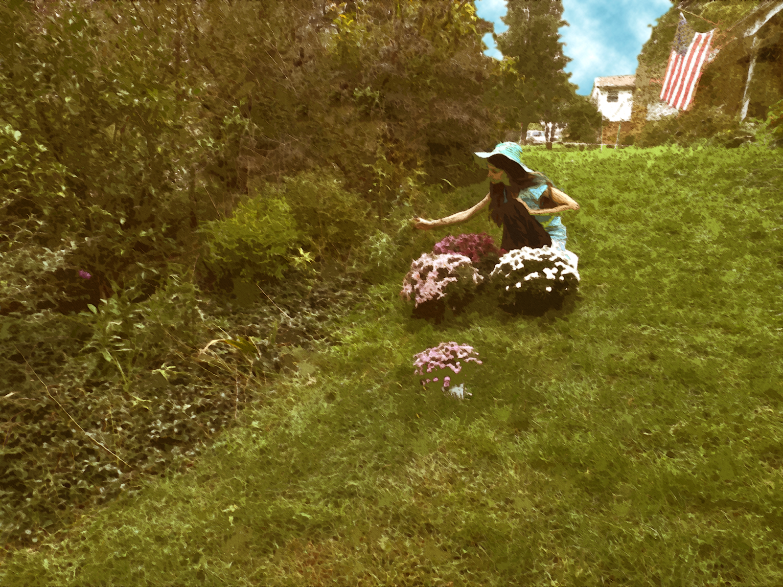
Okay, I admit, that is likely the worst title I've ever put on this blog.  Anyway, as the title suggests, I've been working on filters as part of my 2nd assignment for college: emulating other artists' artwork.  First, I tend to make what I'm working with a Smart Object (right click on the layer, then press "Convert to Smart Object") so I can modify the results later, but doing so isn't absolutely necessary. To make my stuff look like other artists' paintings, I was taught that (in Photoshop) pressing Filter -> Filter Gallery and selecting the "cutout" option, dropping the number on colors from a few million down to 8 or even 3, was a good start.  After that, selecting Filter->Oil Paint (which sadly isn't available on some older and newer versions of Photoshop, but it's on CS6) gives it a paint-like texture, and after that it's a good idea go to the Filter Gallery again and give it an "angled strokes" filter and

More Matteing!

Image
I've been doing a bit more with After Effects!  Although it isn't a perfect matting, I've still done something.  Anyway, here's my latest one: Klenda, Oob the Prime Minister and myself in Mongolia! Although the background was only a still picture because I couldn't find a video with a camera less than 300 feet off the ground, I was still able to add wind noises, remove the audio noise with Audacity (basically PhotoShop for audio), and create the effect of snow!  Next up will probably be Japan and India! 

College Assignments

Image
So as it turns out, my college class which I thought was on photography alone has a lot to do with Photoshop as well.  And my first assignment was to take five selfies and Photoshop them.  The only problem is that unlike most teenagers, I actually dislike selfies.  That said, the fact that my teacher phrased them as "self portraits" made it a bit better.  None of the pictures from this assignment were taken on a smartphone.  I'll only show three for now.  This first picture doesn't look like a selfie--in fact, I hadn't originally intended it as one--, but the teacher approved it.  I mostly took a picture of a swimming pool roof and altered the colors, then took a zoom-in picture on one of one of the lights and arranged those in a pattern, faking the"overlap" of the lights in the middle by putting a mask over (making invisible) a part of one light.  The second one is more of a noticeable self-portrait.   I added the shadow manually with the brus

A Breif Note: Mirai on Hold for a While

Image
Hi, As you may have noticed, I'm not updating my blog, let alone Mirai, very often.  Right now, that's because I'm currently beginning a college class, along with another project unrelated to CGI, some more Japanese, etc.  I haven't forgotten Mirai, but it may take a while for me to get back to it.  Thanks! In the meantime, here's a picture from Bill and Ted: 

Mirai

Image
This is it.  Do you remember when one year ago , I said that I had something big under plans?  Something involving both live action and computer animation?  Well, it's been one year.  I've gotten a considerable bit better--both at the plots and the animation.  After a lot of planning, I've decided to do something about it.  As I was at the Mediterranean Sea for a week without internet, Blender was my primary computer priority.  And here is the first scene: This is the only scene I've rendered so far, though it's one of my most professional-looking, in my opinion.  Also my first animation to be rendered at Full HD, we can see a futuristic city zooming to an important-looking building... This will be one of many brief scenes I'll show before releasing the premier (yet to be recorded).  I'm having big ideas about this.  As usual, you can leave any comments in the comments!  I'm leaving for America soon, to I'll be able to do better animation f

Advancing Some?

Image
Since my Hawaii video, I've decided to pretend to widen my budget, although as I'm currently on my laptop in the middle of Spain, my budget is if anything lowered.  However, I've noticed that one factor in great CGI is moving cameras, so I've since decided to utilize that.  I've combined this with MakeHuman , a character creation suite (it Makes Humans).  I've ended up with a brief animation mostly intended as a test for cinematography and MakeHuman bone rigging (movement) or else a brief scene in some longer animation:  I can't seem to get the character to walk forward from the bones alone, but that'll only take work and time.  Also in progress is to figure out how to make the people affected by gravity--it works for "cloth" effects, but not for the actual objects and people (as you can see, the foot is actually in the air as the person is taking a step). However, I've decided to try and "do more" with my animation and get m

Some (Serious) Mattework

Image
On our Big Trip around the world, we've been taking some "recordings!"  As a very generous gift, my grandparents gave me a full greenscreen and lighting set!  After transforming our living room into a studio, I made a few recordings of ourselves and then got to work on After Effects!  Overall, it was easier than I expected--after the work on the Ninjacopter, I didn't have to figure much out. There were a few differences between this Mattework and my first successful greenscreen-ish project .  For this one, you again go to the menu on the far right and choose the "keying" drop-down menu.  This time, I dragged & dropped "color range" onto my video and used the eyedropper tool to select several different shades of green from the background. The trouble, however, was the same one I'd run across with the Ninjacopter last post: some areas, in this case parts of our hair or heads, would disappear if I got too exact--apparently we were standin

Finally--a Physical Mattework!

Here it is!  Using the same technique used in Star Wars* (although a bit shakier and with less axes) I've done an actual green screening/mattework using my brother's birthday present! It looks a bit cheesy, but I'd say a lot of the trouble is that the lighting was a bit wrong.  As well, an iPhone, despite recording at Super HD (aka 2.1 Megapixels=not actually that high), isn't quite at the professional level of video cameras.  Either way, the problem was that if I'd try to take away certain shades of green, parts of Oob's Ninjacopter would also disappear.  *Star Wars: instead of moving toy ships on Popsicle sticks like everyone else, Lucasfilm had the cameras moving while the detailed ships stayed still in front of a blue screen. 

2-D Animation

Image
Hi!  Earlier on, My sister and I did a 2D animation class using Flash, and I eventually came up with this: It was actually quite a bit like Illustrator, except with animation.  An interesting note is that for animations, you have to make your objects into symbols if you want to animate them (or, more specifically, to fill in keyframes--otherwise you'll have to do each frame manually; not as fun at all).

It's Been a While...

Image
So MERRY CHRISTMAS!!!!! (Yes.  I know. Don't. Please just don't.) Used: Clone Tool (restoration), Quick Masks & Hue/Sat layers (color).

My Photoshop Project

Image
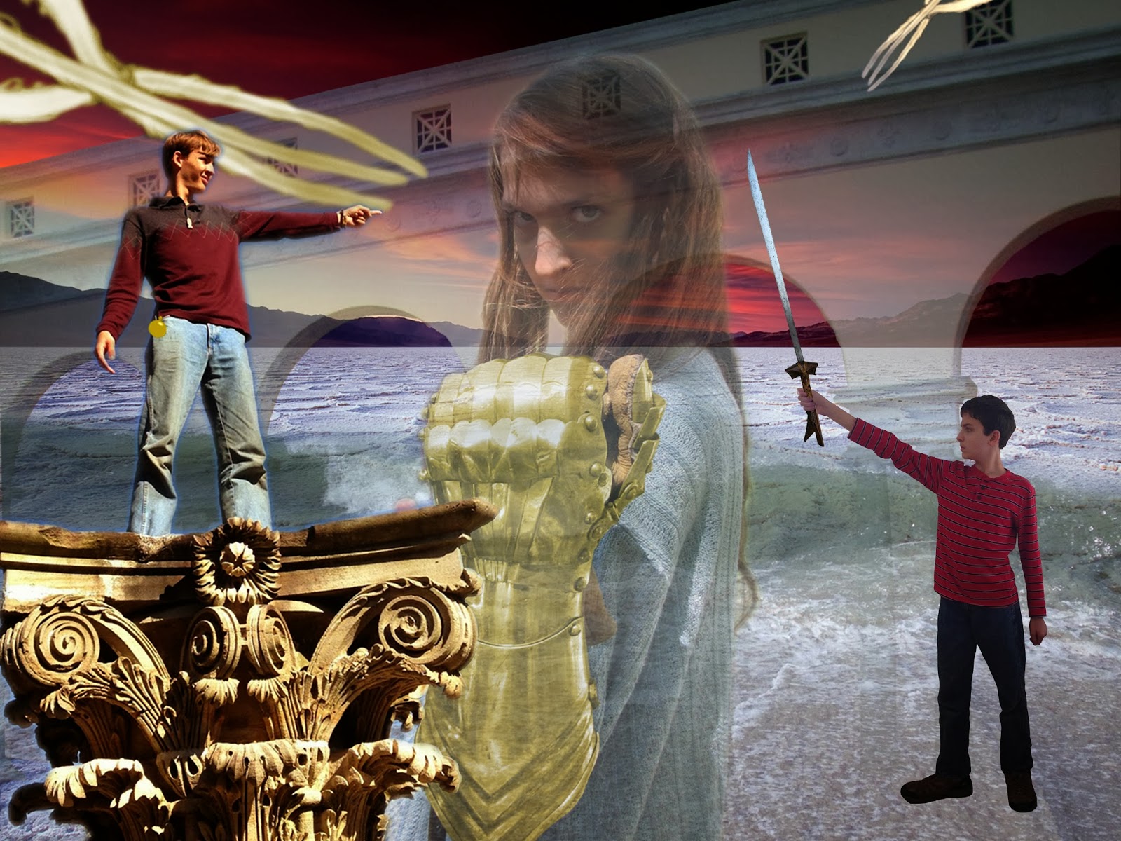
Finally!  After weeks of anticipation (from me, anyway) I've finally come to my last post on the college class!  Using quick masks (like erasing except it "hides" information instead of just erasing it), adjustment layers (see last post) and technically copyrighted material, I've produced my final project!  One of my favorite things about this is that a lot of it is actually real--I really was standing on that pillar, and Klenda actually was wearing that glove, although it was originally silver (and Zorg's kampilan was photoshopped, unfortunately).  You can see where I got some photos right here .  The others I either took (Zorg), got from Wikipedia (the sword) or Google (Death Valley back there--under copyright, but apparently if you change the meaning of the picture--e.g. from nature to action--the copyright doesn't count).  If you have any questions, feel free to post some in the comments!

PS & Id

Image
My finals are DONE!  That said, I have quite a bit of catching up to do. First, I'll post about InDesign (even though I did PhotoShop first).  InDesign (Id) is for page layouts, pull quotes and that kind of thing.  Here was my project: I had to make the title and pull quote text fancy (via Paragraph Styles --assuming you've set the workspace to Essentials by going to Workspace-->Essentials, it should be on the right side of the screen), add images (File-->Place or Ctrl-D) and make the text wrap around it ( Text Wrap, next to Paragraph Styles ).  I also had to assign page numbers (from Pages , upward from Paragraph Styles , you can set them from the master pages). Next is the Table of Contents design. This used tabs to adjust to what degree which text is left-justified or right justified. On to PhotoShop! First, I had to clean up this: Before  This was done mostly by copying & pasting different parts of the screen (the H in "Home&quo